Driving Product Design & Strategy to redefine Yext’s Social Platform with Modern Campaign Management
Leading end-to-end design for a high-priority initiative, shaping a flagship product.
ROLE
Lead Product Designer
COMPANY
Yext
DURATION
JAN - MAR 2024
As Product Design Lead,
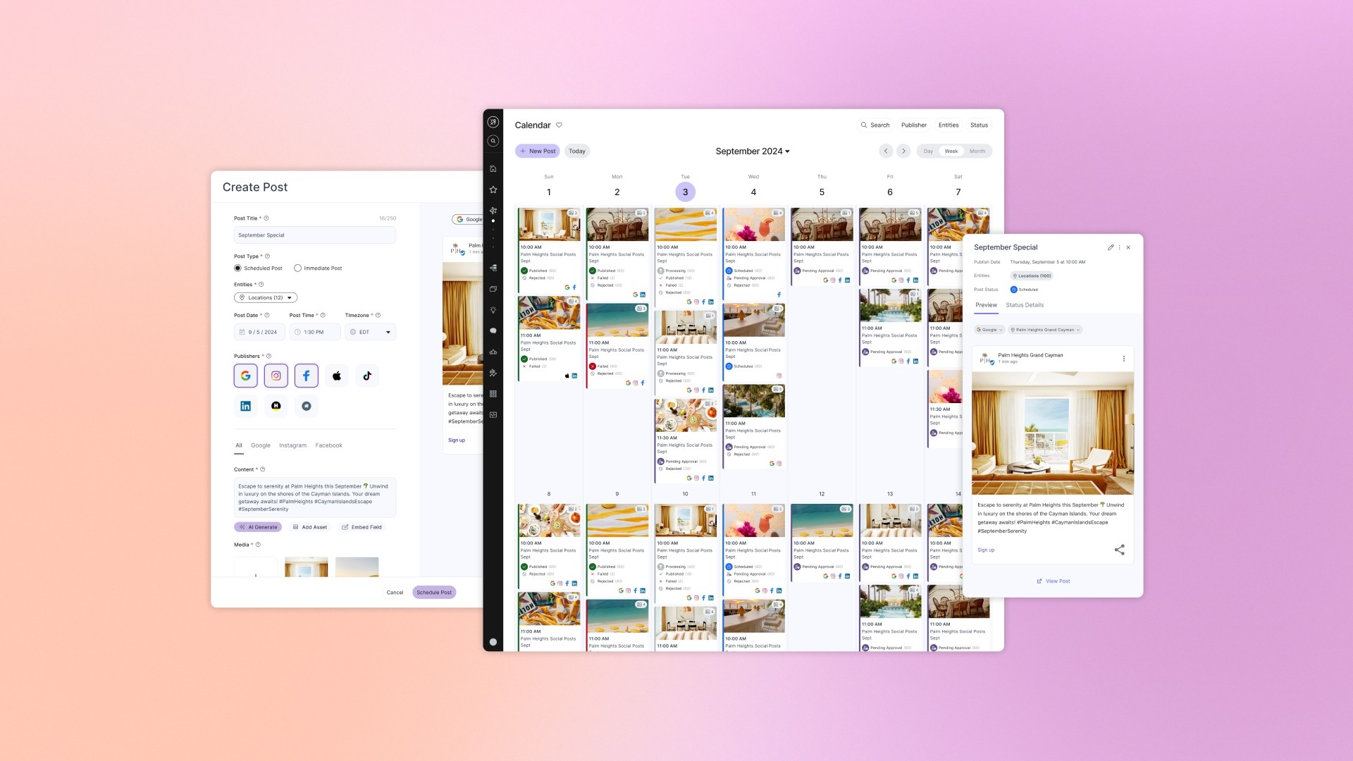
I drove the design of a revamped Social product that enabled users to efficiently manage campaigns for multiple locations across multiple publishers in a modern, market-competitive platform.
12
Weeks
Core Features Design Complete
10%
↑
Converted Leads
175
↓ Hrs
Time spent managing local social media
24%
↑
Listings Performance Attributed to Social
COMPANY OVERVIEW
Yext centralizes business information through its Knowledge Graph CMS and AI tools, enabling seamless content syndication across digital platforms.
After recent AI Search and Chat projects fell short of expectations, Yext looked to recover revenue by listening to feedback from existing and at-risk customers to shape its next flagship product.
TEAM
I was part of a core three-person Engineering, Product, and Design (EPD) pod, supported by engineers and a researcher, with additional input from Product Leadership and oversight from the Executive O-Team.
As Product Design Lead, I drove Social’s design while maintaining my leadership role across Yext’s broader product suite, including Content, Connectors, Listings, Reviews, Search, and Chat.

PROCESS & TIMELINE
Completed core design features in 12 weeks as part of a newly established EPD Pod, adapting to shifting priorities, frontend limitations, and integrating an evolving design system in active development

RESEARCH & DISCOVERY
Research & Discovery activities lead to key insights that informed strategy, features & functionality, extending our understanding of our target users and shaping the scope of the project.
Synthesized internal research for opportunities and business strategy context.
Analyzed competitor platforms to identify common features, patterns and opportunities.
Extended the “Admin” persona with specific goals for the social feature set.
Estimated levels of effort and prioritized development areas for the EPD pod.
Directed UXR to conduct a comprehensive analysis of 11 competitors. Our goal was to understanding how to achieve feature parity and uncover opportunities
PHASE 1: Common patterns
Calendar Patterns
Post Representation
User Actions
Advanced Features

PHASE 2: Detailed Interactions
Post Creation
Post Editing
Multi-Publisher Posting
Complex Post PReviews

Building all Common features would ensure parity, while Rare and Unique elements presented opportunities.

USERS
From 7 customer interviews, I extended the Core Admin user type to encompass Content & Social Marketer needs.

LEGACY PRODUCT
The legacy social posting feature was buried within the Listings product and was functionally limited.
1
Limited Navigation: The standard header limited the addition of calendar features.
2
Inefficient Post Creation: A rigid in-line form created a clunky content input experience, with limited preview functionality.
3
Lack of Scheduling Options: Users were forced to publish posts instantly, limited scheduling options.
4
Poor Post Management: Published posts appeared in a linear timeline, making it difficult for users to locate, edit, or manage content efficiently, especially at scale.

FLOWS
To discuss approaches I created a breadboard to visualize key flows as wireframes and interactions.

CONCEPT DEVELOPMENT
Expanded initial wireframes into key screens, using the existing design system to quickly demonstrate an MVP of the social platform with standard components.


After socializing, the EPD pod identified the calendar front end to be a significant challenge with existing engineering resources.
BUILD VS BUY
Evaluated 3 Calendar Solutions and Prototyped Key Flows, Collaborating with EPD to select Bryntum and resolve the Build-vs-Buy Debate.

Key priorities included multi-view calendars, tile previews, filtering, and post creation. I prototyped key flows to support discussions and assess feasibility with the Bryntum and EPD team.

CONCEPT DEVELOPMENT
Early calendar views were designed to discuss how flexibly Bryntum could handle in-calendar create, click previews, and post tile variations.

CONCEPT DEVELOPMENT
Post creation methods were also discussed to assess how Bryntum could handle create events with standard components.


CONCEPT DEVELOPMENT
Lastly, to improve usability with high post volumes, I proposed a view options feature to reduce clutter by enabling post grouping controls.

CONCEPT DEVELOPMENT
After selecting Bryntum, product and design leadership began exploring a new design system based on the SAAS UI library to refresh the platform.
I flagged strategic, operational, and technical concerns about changing design systems mid-development.


CONCEPT DEVELOPMENT
To mitigate risk, I proposed refreshing GLASS components with an updated aesthetic minimizing effort and reducing risk.
Despite these efforts, leadership chose to move forward with SaaS UI and abandon Bryntum.
Calendar Views
With the adoption of SaaS UI and the shift away from Bryntum, I advanced calendar view designs through key activities, including:
Built interim SaaS UI components in Figma
Designed calendar views using familiar interaction patterns.
Tested design variations through user preference feedback.
Interim Components
Created base Figma components aligned with SaaS UI as an interim solution while a separate design system team began work on the broader component library.

Calendar Views
Implemented the interim SaaS UI components to a simplified Calendar design for month, week, day.

1
SaaS UI color palette and components applied
2
Simplified filters reappointed to increase horizontal space
3
Week view featured a novel scrolling calendar layout

Calendar Views
To optimize the calendar, I tested header layout variations using a simple preference test.
Although users preferred designs with fewer lines, the perceived benefits were minimal, so we continued with the original design and planned to gather additional in platform feedback .
Tile previews needed to deliver at-a-glance details across calendar views. Scope changes required us to rethink status display and iterate on the initial designs.
Refined tile preview designs to align with SaaS UI components.
Evaluated scope changes, and mapped the lifecycle of a post and its statuses.
Integrated dynamic status logic into new tile preview across day, week, month.
Tile Design
Key post details (time, title, publisher, and status) were identified, and designs were updated using interim SaaS UI components.

Scope Changes
Navigating Scope Changes with a New Grouping Approach

Integrating Changes
The fallback approach introduced complexities for post statuses. Given these changes, I refined tile previews for day, week, and month views to incorporate dynamic status logic across views.

1
Primary critical status
2
Secondary status list
3
Condensed primary status
I designed a post creation experience that maintained continuity with the calendar, balanced content entry with post previews, and allowed for future feature enhancements.
Developed an initial MVP create experience for generic content
Evaluated approaches for adding publisher specific fields and media
User tested variants and selected a version for the initial build
MVP Development
The initial MVP approach for post creation applied a single set of content assets (media and post copy) across all publishers.
1
Primary critical status

2
Secondary status list

3
Condensed primary status

Evaluation
However, when attempting to support publisher-specific fields, the long-form layout became less usable and increased user’s cognitive load.
1
Post Settings: Enabled users to select multiple publishers publishers and locations (either individually or as groups), along with post date and time.
2
Post Content: Included media (images or videos) and accompanying text or captions.
3
Publisher-Specific Settings: Displayed dynamically based on selected publishers, adding more fields and increasing form length.

Testing and Iteration
Testing of 15+ create experiences revealed a preference for outer tabs to group settings and content, with separate tabs for managing publisher-specific fields.


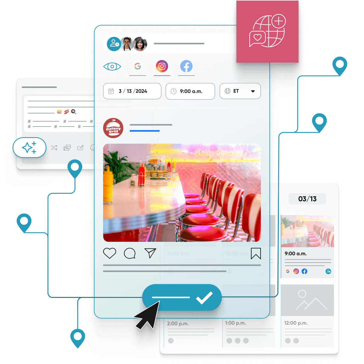
Post previews were essential for feature parity with competitors. I designed a dynamic, reusable solution that supported real-time previews in both the post creation flow and calendar tiles, balancing functionality with resource constraints.


A competitive product designed in 12 weeks, but with strategic risks and uncertain returns.
4.3
/ 5
Ease of Use & Navigation
4.4
/ 5
Clarity of Test Goals
4.7
/ 5
Learnability
1
Suggested
Core Feature
PROJECT OUTCOMES
12
Weeks
Core Features Design Complete
24%
↑
Listings Performance attributed to Social
175
↓ Hrs
Time spent managing local social media
10%
↑
Increase in leads converted into clients